bloomer
A branding and packing project for a fictional wellness brand.
Project Overview
Another fictional brand concept, Bloomer is a Wellness brand designed to promote well-being and self-care through self-care but include candles, affirmation cards and skin care products. Though there is more to self-care than skincare and candles, these items can still add some sense of calm to a person's every day. Inspired by grace, femininity and calm, the package introduces a collection of items that are designed to transform everyday spaces and routines into calming sanctuaries. The name Bloomer suggests the idea of blooming into a better version of yourself, much like a flower.
PROJECT TYPE
Branding
Packaging design

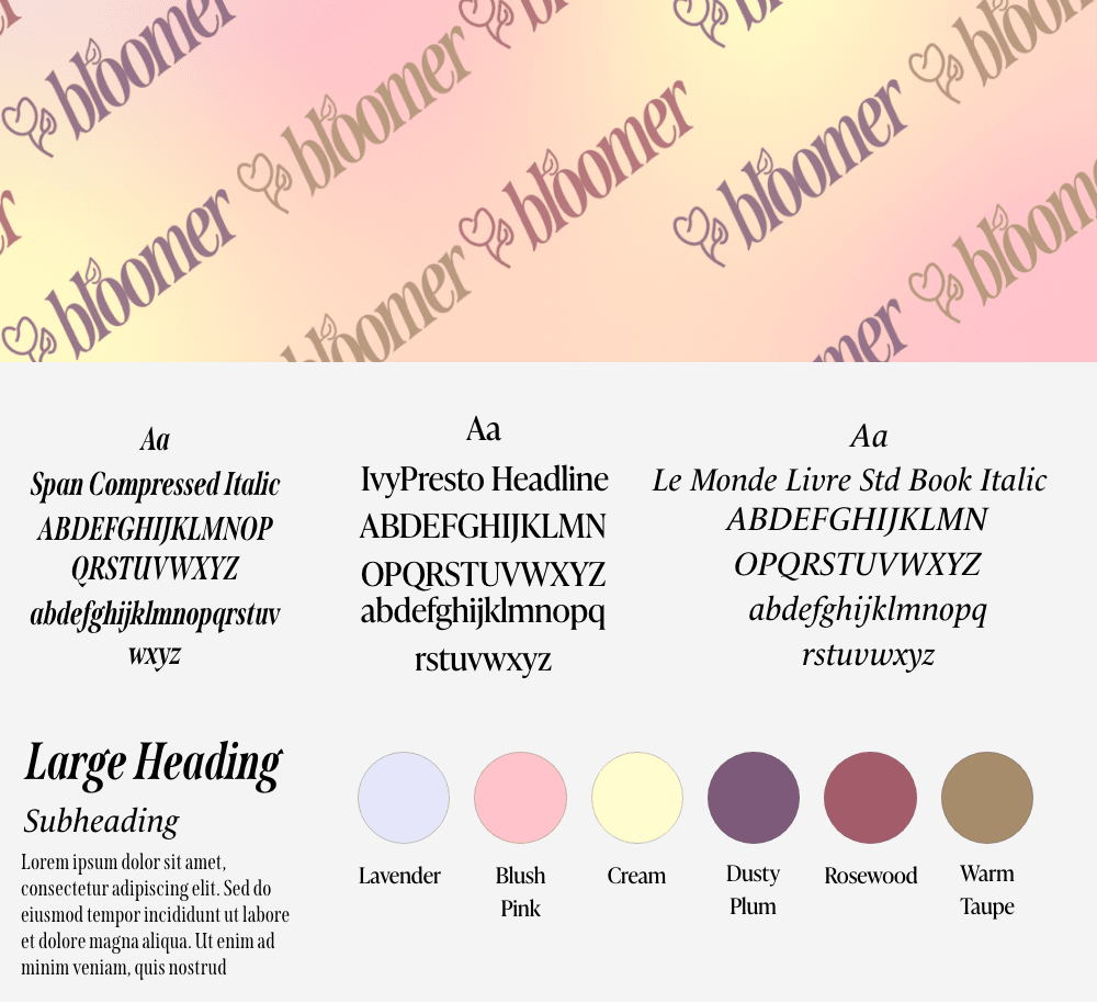
Logo Variants, Font, and Colour Palette
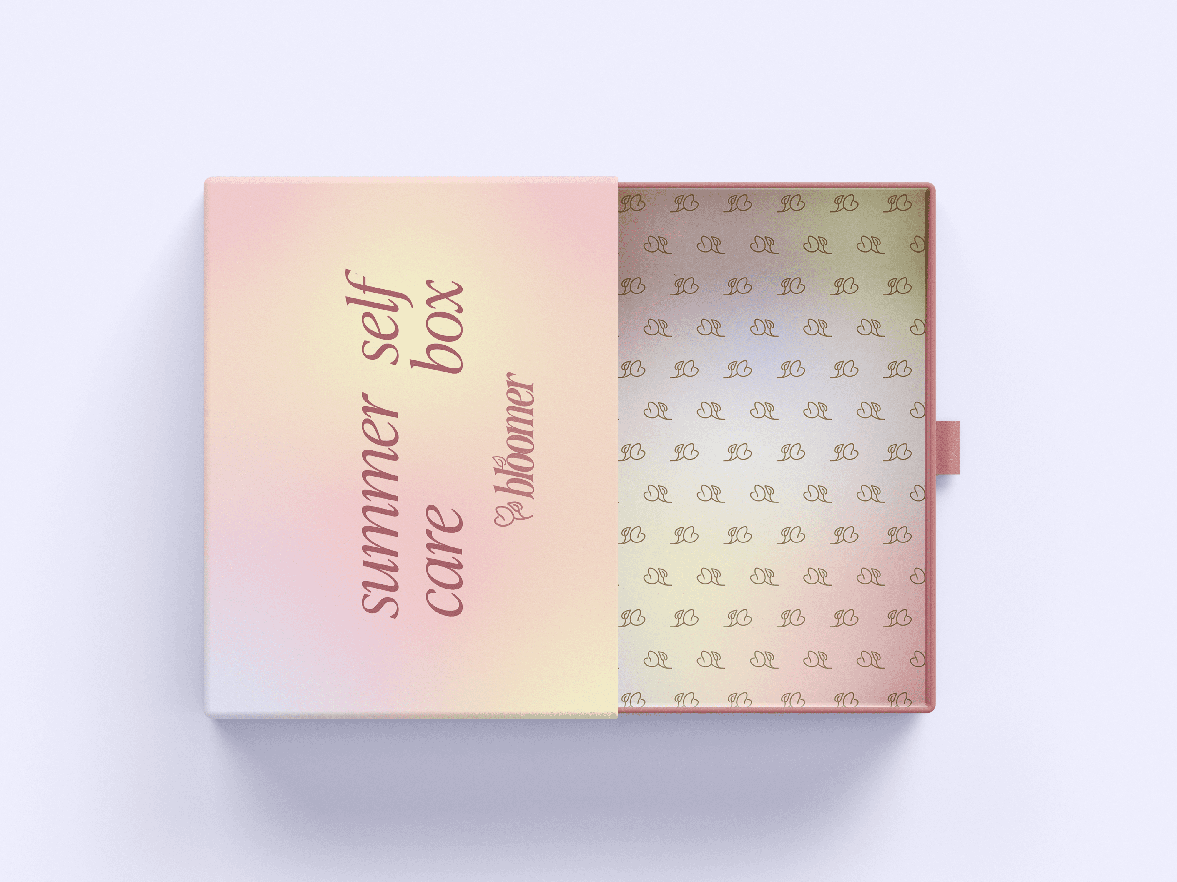
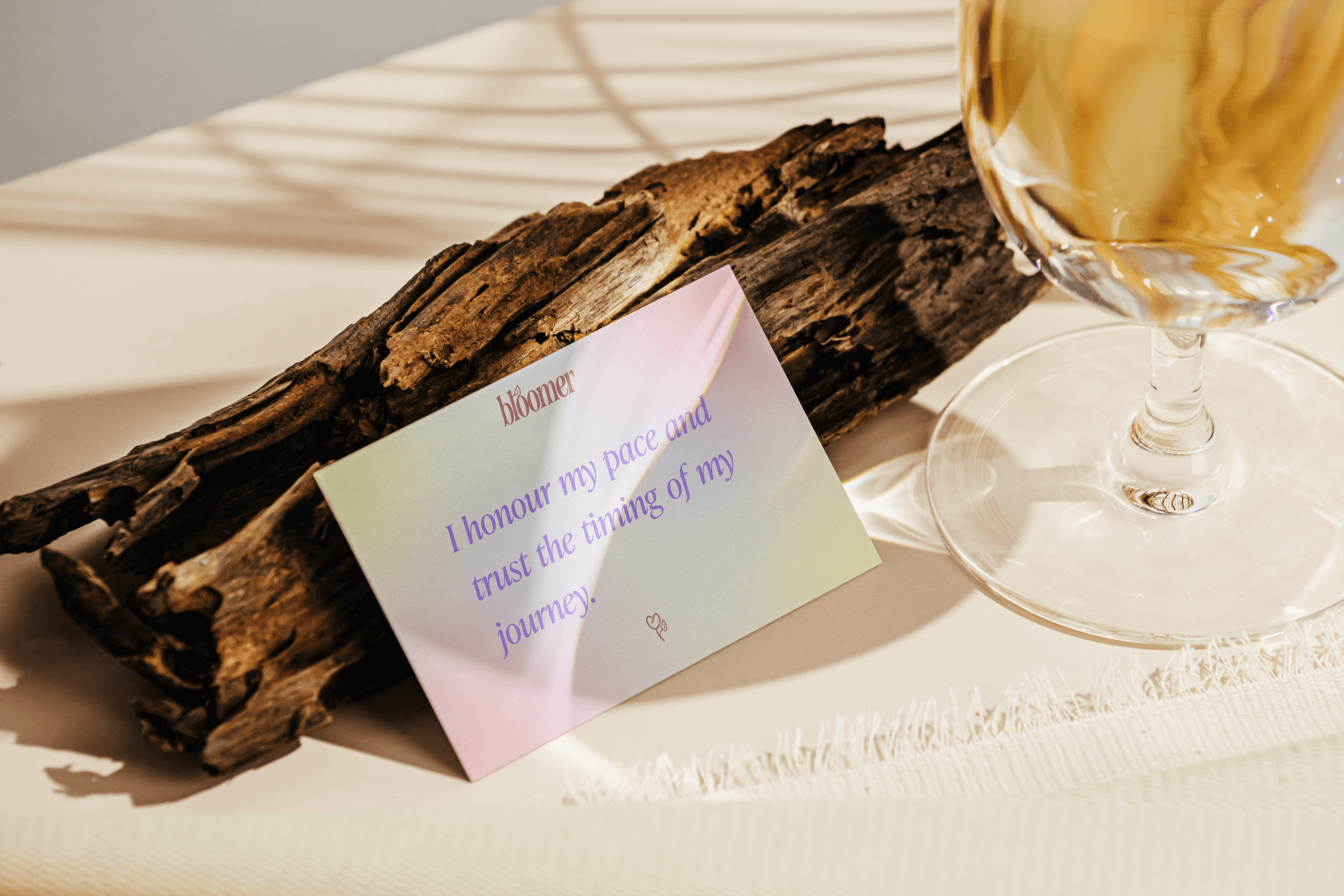
Mockups
Outcome & Reflections
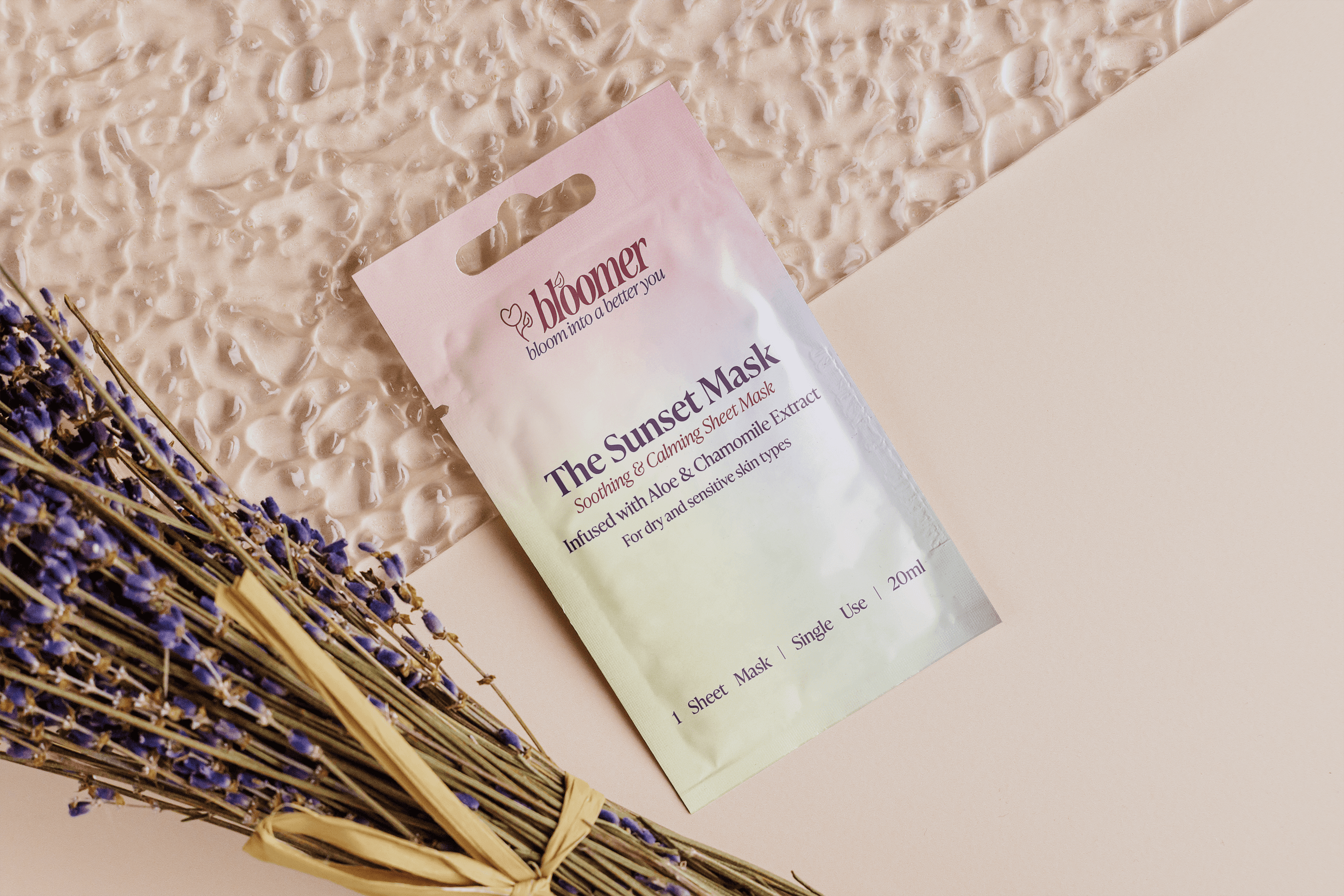
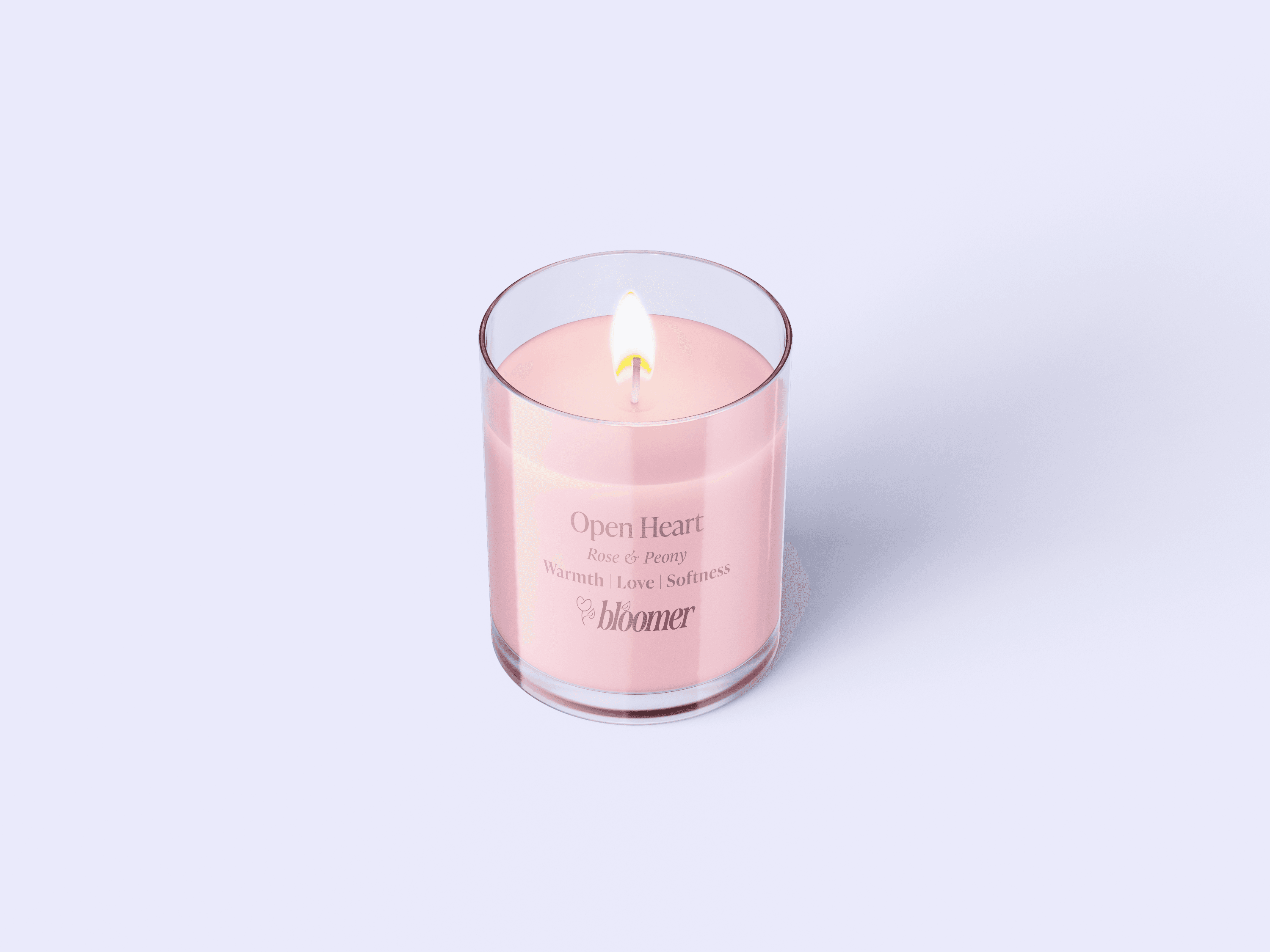
The identity of Bloomer is grounded in soft pastel aesthetic with a colour palette that was selected to create a sense of relaxation, gentleness and warmth when associated with Bloomer's aesthetic. The brand’s target audience is young women between the ages of 20 and 50 who have busy lives that could use 20 minutes of their time for themselves.
The main goals of this project what a design an alert that represents softness and elephants, create packaging for the self-care box and create affirmation cards and candle designs that are included within the care package.
The logo icon, which is a tulip that subtly resembles a heart, was chosen as tulips are flower that represent perfect and deep love, which Bloomer’s goal is to encourage the customers to build a perfect and deep love for themselves by taking the time to take care of themselves using the products within the self-care kids. The self-care kits being a means to help the target audience bloom into a version of themselves that has a deep sense of self is represented through this. The font is simple and easy to read, embellished by a leaf on the letter L to represent growth before you bloom.
The journey to creating the logo was a little difficult for me, as at the start, every style and icon I had designed didn’t seem to fit the brand’s identity or their name. I had various versions of fonts and icons, but as this was a short-term project, I decided to start from scratch and get back to the basics about the brand, researching brands that were in a similar place. The heart-shaped tulip icon was a design I carried over from the original designs I created, as I felt it was an integral part of my version of what Bloomer could be.
The main 3 colours, lavender, blush pink and cream, were given darker counterparts to use on labels, so that the text was legible and could be seen against the colour of the packaging. I chose to use these colours rather than shades of black to still include personality across all items in the self-care boxes, such as the face mask and the affirmation cards. The logo also varies between these colours, which can be used in the future to create different colour variations and pairings in the logo for different packaging styles and ideas. An example of this is that the mock-up has a package called “The summer self-care box”, which implies that customers can purchase and receive self-care boxes with four different names, different seasons and different purposes. This allows a certain personality and customisation that customers can play with and engage with when purchasing items from Bloomer.
As one of my main focuses in my work is accessibility, I choose to stick to fonts across the whole brand that were both easy to read and still expressed softness in elegance. This can be seen in the logo font and the font used across the affirmation cards, the candles, and the main packaging of the self-care kids.
This being my second project, I was much more comfortable engaging and navigating the necessities for the design brief. The logo carries a cute and soft tone that the brand has to offer, although I do feel that it may need more iterations before it looks perfect for this brand specifically. The mockups for the packaging were perfectly balanced in representing femininity, growth and touching the target audience. I would have loved to also explore the social media marketing and other digital assets for this branding project as I know these are important in creating and solidifying the brand's identity.