the third place
A fictional cafe branding project.
Project Overview
The Third Place is a fictional coffee shop brand designed to create a space that nurtures community, comfort and peace outside the home and workplace. Based on a theory introduced by Ray Oldenburg, the need for people to have a third place, such as the gym, cafes, or sports activities, is imperative to people’s wellbeing (E. McGowan, 2025). The café’s concept was to be a third place for its target audience, remote workers, students and creatives seeking a productive and energy boosting atmosphere. The goals of the project were to create a cohesive visual identity through logo design, menu design concept, and packaging design for takeaway items.
PROJECT TYPE
Branding
Logo Design
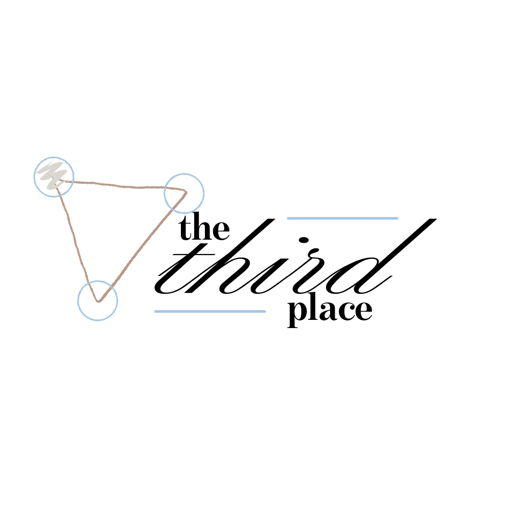
Logo Variants, Font, and Colour Palette

Mockups

Reflection & Lessons Learned
The colour scheme focused on a cool colour palette to evoke a sense of serenity, leaning into the fact that the space is intended to have a calming and relaxed atmosphere. The colour Icy Blue is used quite often as it is a colour psychologically associated with peace and serenity (O'Connor, 2009).
The design for the logo is a call to the Third Place theory, as Oldenburg states that there are three spaces, home, work and your third place, which are represented by the three points of the triangle. For the logo specifically, all points of the triangle are circled, and the point that represents the café is highlighted by a pencil-like scribble in the colour Sage Beige.
I ensured that the fonts selected were legible and clear to read to maintain accessibility, although I do believe that the font for the logo itself would need to be revised as it may not be as clear to read, especially when italicised.
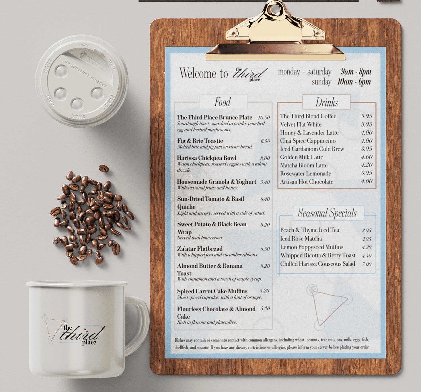
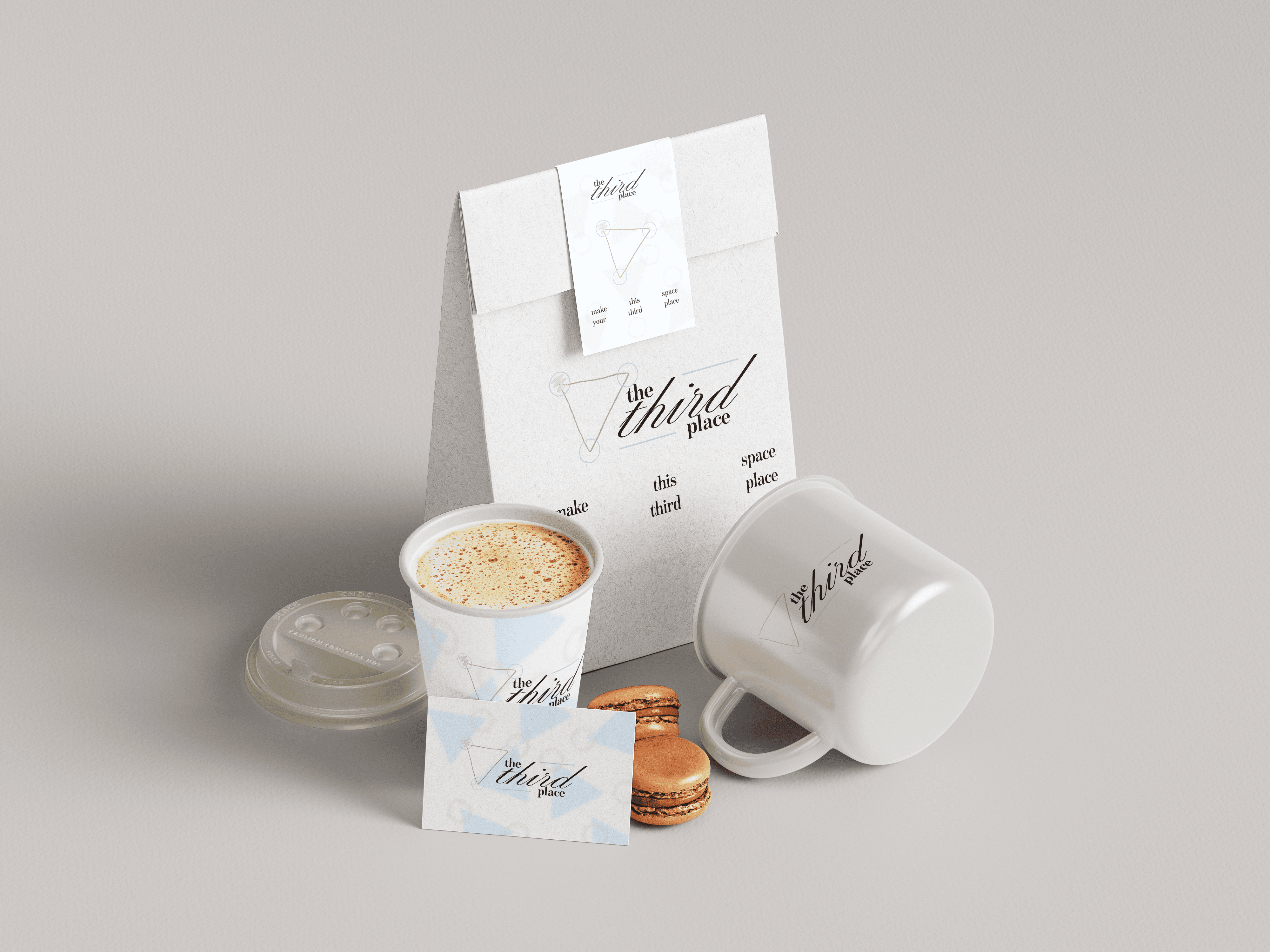
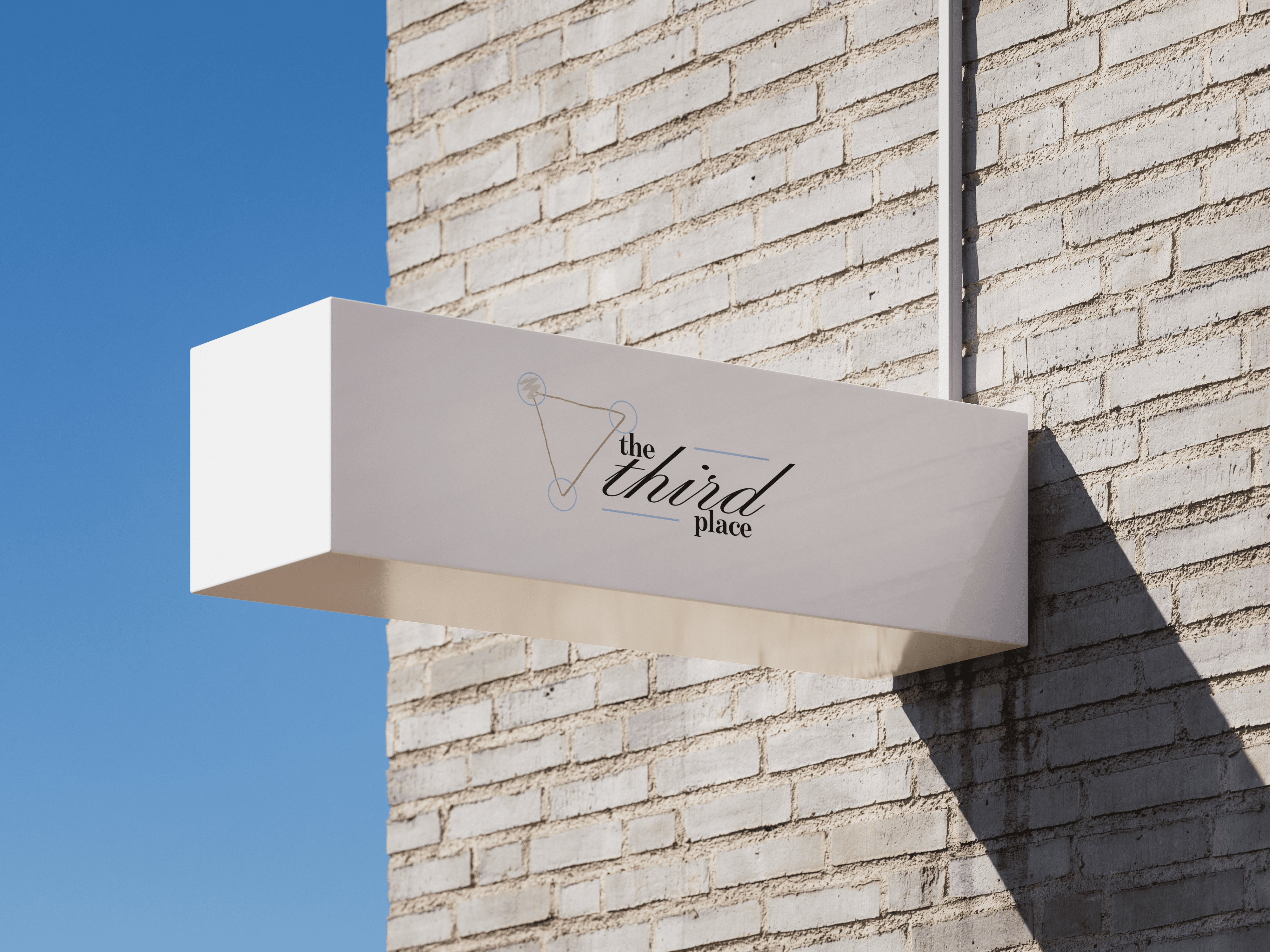
Included in the mockups for The Third Place were mug designs, packaging for takeaway bags, cups, business cards, menu and store sign. I tried to keep the use of colour minimal across the packaging to be easy and simple on the eyes. The menu has separate spaces for each category sold at the café to make it easy for customers to know where to look, depending on what they are planning to order from the café.
As this was my first branding design project, I enjoyed putting my skills from my varying experiences to practice, bringing a design idea to life whilst also gaining new skills and a deeper understanding of tools such as Adobe Illustrator and Adobe XD. This was a brilliant opportunity to think about and explore, on a practical level, some of the important aspects of bringing a brand identity to life. I believe I created a clean and cosy look to the logo and menu, whilst relying on research-based concepts to inform decisions made for the designs.
Of course, with some iterations and some more time, I could further develop the logo and create concepts for social media to explore all avenues of branding this fictional cafe. I would also try harnessing social media to create event posts that speak to the part of the brand that focuses on community, such as quiz nights, open mic events, networking events, and other community-based events of a similar nature. Overall, I learned a lot from this experience and fit to put these skills into practise and refine them to become a better designer.